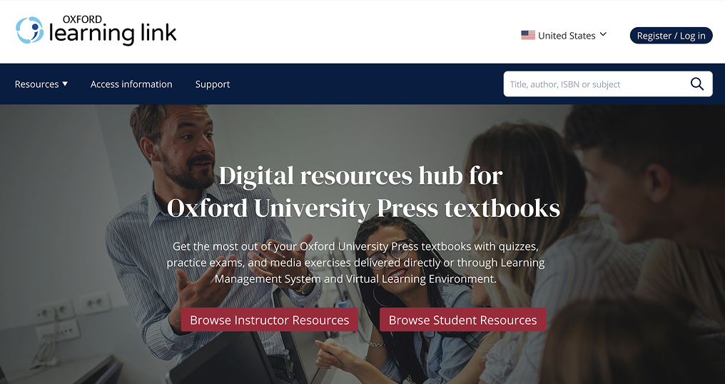
Oxford Learning Link
Making learning materials easier to find, access and use
In short
Making learning materials easier to find, access and use
Oxford Learning Link was organised around OUP’s internal content structure rather than the tasks instructors and students came to complete. I led the core UX redesign across information architecture, search, product pages and access. The new model replaced page-based browsing with unified search and filtering, brought related resources into one product workspace, and reduced the getting-access journey from eight screens to three. I also translated the designs into shared UI patterns and ran a two-part UX workshop that helped developers assess the product from a user’s perspective.
Role: Senior UX Analyst / Product Designer
Users: Higher Education instructors, students and LMS/VLE administrators
Constraints: Existing functionality and technical model, implementation by OUP’s internal development team, phased delivery
The interface reflected the organisation, not the user journey
Oxford Learning Link connects textbooks with e-books, assessments and supporting teaching and learning materials. Instructors find resources to assign through an LMS; students access content throughout their course.
The existing experience required both groups to understand OUP’s internal hierarchy:
Discipline → umbrella product → child product → instructor or student resources → chapter → individual resource
Standalone discipline pages contained long lists of products. Instructor and Student links created separate routes through largely overlapping content. Product pages repeated covers, descriptions and access messages, while dense resource lists made specific materials difficult to locate.
Terminology such as product, title, resource, Cloud, LMS/VLE and self-study added another layer of interpretation before users could act.
The initial brief proposed many individual improvements, from tutorial overlays to tabs and persistent navigation. I first stepped back from those proposed solutions and reframed the work around four tasks:
Guide users by context, not by system architecture.
One discovery model instead of separate catalogue pages
I removed standalone discipline pages without removing disciplines from navigation.
Selecting a discipline now opens the shared results experience with that discipline already applied as a filter. Users can see all matching materials, refine the results further, or search by title, author or ISBN.
This made search and browsing part of the same model:
The approach preserved familiar navigation while removing an unnecessary layer from the journey.
Oxford Learning Link was organised around OUP’s internal content structure rather than the tasks instructors and students came to complete. I led the core UX redesign across information architecture, search, product pages and access. The new model replaced page-based browsing with unified search and filtering, brought related resources into one product workspace, and reduced the getting-access journey from eight screens to three. I also translated the designs into shared UI patterns and ran a two-part UX workshop that helped developers assess the product from a user’s perspective.
Role: Senior UX Analyst / Product Designer
Users: Higher Education instructors, students and LMS/VLE administrators
Constraints: Existing functionality and technical model, implementation by OUP’s internal development team, phased delivery
The interface reflected the organisation, not the user journey
Oxford Learning Link connects textbooks with e-books, assessments and supporting teaching and learning materials. Instructors find resources to assign through an LMS; students access content throughout their course.
The existing experience required both groups to understand OUP’s internal hierarchy:
Discipline → umbrella product → child product → instructor or student resources → chapter → individual resource
Standalone discipline pages contained long lists of products. Instructor and Student links created separate routes through largely overlapping content. Product pages repeated covers, descriptions and access messages, while dense resource lists made specific materials difficult to locate.
Terminology such as product, title, resource, Cloud, LMS/VLE and self-study added another layer of interpretation before users could act.
The initial brief proposed many individual improvements, from tutorial overlays to tabs and persistent navigation. I first stepped back from those proposed solutions and reframed the work around four tasks:
- Find the right product.
- Understand what is accessible.
- Locate a relevant resource.
- Open, assign or download it.
Guide users by context, not by system architecture.
One discovery model instead of separate catalogue pages
I removed standalone discipline pages without removing disciplines from navigation.
Selecting a discipline now opens the shared results experience with that discipline already applied as a filter. Users can see all matching materials, refine the results further, or search by title, author or ISBN.
This made search and browsing part of the same model:
- disciplines act as entry points and filters;
- compact result cards surface the information needed for comparison;
- additional filters narrow large result sets;
- audience and access states are communicated within results instead of creating separate catalogue structures.
The approach preserved familiar navigation while removing an unnecessary layer from the journey.
A single workspace for products and resources
Umbrella, child-product and resource content was brought into a clearer product structure. Instead of sending users through separate Instructor and Student pages, the redesigned product page shows the available resources by default and lets people narrow them according to their needs.
Filters cover:
Resource cards distinguish accessible and restricted content without repeating the same explanatory message on every item. Navigation follows the current filtered set, so users can move between relevant resources without returning to the complete list.
For instructors working with larger collections, I designed a download mode with multi-selection and batch download. I also redesigned individual content experiences, including flashcards, as part of the broader resource model.
Umbrella, child-product and resource content was brought into a clearer product structure. Instead of sending users through separate Instructor and Student pages, the redesigned product page shows the available resources by default and lets people narrow them according to their needs.
Filters cover:
- availability and access;
- product and chapter;
- resource type;
- instructor or student relevance.
Resource cards distinguish accessible and restricted content without repeating the same explanatory message on every item. Navigation follows the current filtered set, so users can move between relevant resources without returning to the complete list.
For instructors working with larger collections, I designed a download mode with multi-selection and batch download. I also redesigned individual content experiences, including flashcards, as part of the broader resource model.
Getting access in three clear steps
The original getting-access journey stretched across eight screens. I consolidated it into a three-step flow with a clear choice at the start:
Each route reveals only the information needed for that choice. The interface communicates progress, provides appropriate disabled and error states, and places support links within the flow.
Successful redemption ends with an expiry date, a link to the account and a direct action to open the content. The purchase route collects the required customer and institution details before checkout rather than exposing the full process upfront.
This reduced the getting-access journey from eight screens to three while preserving the existing access options and underlying functionality.
Support organised around user questions
Support information had previously been distributed across product pages and contact routes, making it difficult to know where to begin.
I designed a self-service support layer organised for students, instructors and LMS/VLE administrators. Search, topic pages, related articles and useful links provide several routes to an answer, while contextual links connect product and access journeys to the relevant help.
The aim was not to add more instructions to every screen, but to make help predictable and available when it was needed.
Designing with the development team
Because OUP’s internal team would implement the changes in phases, the work needed to extend beyond individual screens.
I documented reusable patterns for controls, validation, search, filters, access badges, content cards, typography, colour and iconography. Where appropriate, patterns such as filters were aligned with the wider Oxford Academic ecosystem.
I also created and facilitated a two-part User Experience for Developers workshop. Through practical exercises and role-playing usability sessions, developers experienced the product as users and identified issues they had previously overlooked.
“Hands-on, insightful, and incredibly valuable… the role-playing of user testing scenarios brought the concepts to life.”
— Lakshmi Jayakumar Menon, Oxford University Press
Result
The redesign replaced a fragmented collection of catalogue and role-based pages with a shared model for discovering, accessing and using learning materials. It was delivered in phases around development capacity and supported by reusable interaction patterns rather than isolated mock-ups.
The clearest quantitative improvement was the reduction of the getting-access journey from eight screens to three. Just as importantly, the work gave the development team practical methods for reviewing future changes through a user lens.
The central design move was not adding guidance to the old structure. It was reducing how much of that structure users needed to understand.
The original getting-access journey stretched across eight screens. I consolidated it into a three-step flow with a clear choice at the start:
- redeem an access code;
- purchase time-limited access;
- activate a trial.
Each route reveals only the information needed for that choice. The interface communicates progress, provides appropriate disabled and error states, and places support links within the flow.
Successful redemption ends with an expiry date, a link to the account and a direct action to open the content. The purchase route collects the required customer and institution details before checkout rather than exposing the full process upfront.
This reduced the getting-access journey from eight screens to three while preserving the existing access options and underlying functionality.
Support organised around user questions
Support information had previously been distributed across product pages and contact routes, making it difficult to know where to begin.
I designed a self-service support layer organised for students, instructors and LMS/VLE administrators. Search, topic pages, related articles and useful links provide several routes to an answer, while contextual links connect product and access journeys to the relevant help.
The aim was not to add more instructions to every screen, but to make help predictable and available when it was needed.
Designing with the development team
Because OUP’s internal team would implement the changes in phases, the work needed to extend beyond individual screens.
I documented reusable patterns for controls, validation, search, filters, access badges, content cards, typography, colour and iconography. Where appropriate, patterns such as filters were aligned with the wider Oxford Academic ecosystem.
I also created and facilitated a two-part User Experience for Developers workshop. Through practical exercises and role-playing usability sessions, developers experienced the product as users and identified issues they had previously overlooked.
“Hands-on, insightful, and incredibly valuable… the role-playing of user testing scenarios brought the concepts to life.”
— Lakshmi Jayakumar Menon, Oxford University Press
Result
The redesign replaced a fragmented collection of catalogue and role-based pages with a shared model for discovering, accessing and using learning materials. It was delivered in phases around development capacity and supported by reusable interaction patterns rather than isolated mock-ups.
The clearest quantitative improvement was the reduction of the getting-access journey from eight screens to three. Just as importantly, the work gave the development team practical methods for reviewing future changes through a user lens.
The central design move was not adding guidance to the old structure. It was reducing how much of that structure users needed to understand.